OVERVIEW
As part of a collaboration between RCA Records, Adobe Experience Lab and Elizé Presents, I got to participate in the UX design process for a real life inspired project. The goal was to design a site for an artist to promote the release of her album and tour.
PROBLEM
Artists webpages weren't selling the Pre-Save
1) Majority of users weren't aware of the Pre-save feature or chose to ignore it.
2) Site served as a get-in-get-out experience. Users weren't revisiting the site.
Pre-saving an artists' single or album allows it, upon release, to be immediately available on your chosen streaming platform. During the stakeholder meeting with lead interactive designer at RCA Records, I learned that users were not compelled to pre-save artists’ new album/single. Pre-saving directly impacts the artists’ standing in the Billboard charts. The stakeholder wanted a website design that inspires fans to pre-save their songs, and drive connection by creating a fan portal.
SOLUTION
Entice users to pre-save by invoking their curiosity with a fan portal
Explain what pre-saving is
Provides clarity that pre-saving offers earliest access to latest music release
Eliminates user confusion
Gives fans a means to support their favorite artist
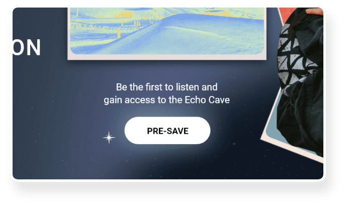
Incentivize the pre-save
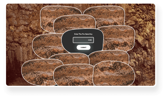
Restrict access to exclusive content available through pre-saving
Utilize appealing UI to invoke curiosity
Encourages engagement with artist outside social media
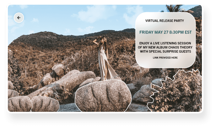
Post announcements on Fan Portal
Fans can keep up to date with latest appearances, live sessions, etc.
Increase number of returning visitors
Invites user to discover more about the artist
COMPETITIVE ANALYSIS + THE GAP
It was NOT explained what pre-saving
is by the competition
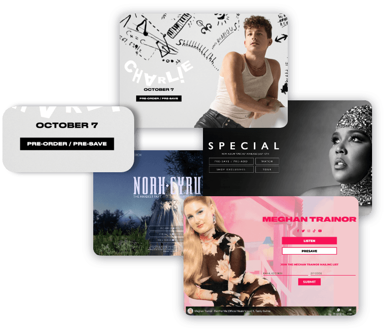
When conducting my competitive analysis, I noticed that none of the artist pages were transparent on the function of pre-saving, an essential contributor to their success in the industry. This presented an opportunity for a solution.
USER RESEARCH
My interviewees felt that there was a lack of incentive to pre-save an album or single
To gain a deeper understanding of how music lovers interact with artist webpages I interviewed 4 candidates who were fans of music and have previously visited artist webpages and asked them the following questions:
1) When you discover a new artist you like, what are some typical next steps you take?
a) Are there any challenges you face when trying to learn about a new artist?
2) What is your process for learning about a new artist?
a) Can you walk me through a recent artist that you learned about?
3) Are there any memorable artist websites you’ve been on?
4) Walk me through the last time you were on an artist website.
5) Have you ever pre-saved or pre-ordered an album or song release? Why or why not?
MAIN INSIGHTS
Upvoting which user needs offer the highest impact
Data points organized via affinity mapping
Purple dots = Priority for user needs
Yellow dots = Priority for business needs
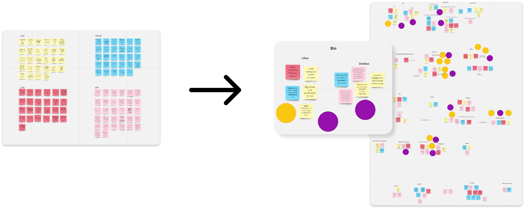
A biography section was a priority for the user to learn more about the artist, as well as for the business to drive SEO and build connection.
The user feedback was organized into corresponding sections of the website and then into common sentiment. The business needs were upvoted first. The most consistent user feedback was upvoted next. This feedback was used to iterate and decide on the final sitemap for the website.
DEFINE AND SYNTHESIZE
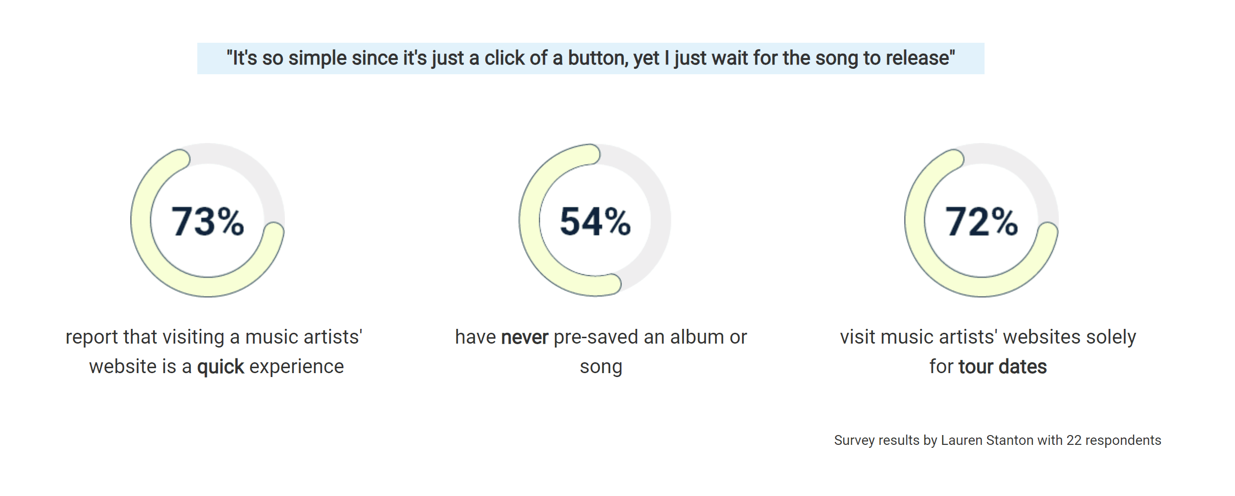
Visits to artist websites were not primarily motivated by engagement and connection
It is no surprise that users who want to connect and engage with artists will head to their social media first. Artists provide exclusive, insider content that build connection with their fanbase. It is noteworthy that searching for tour information was the primary reason users visit an artist's website. This may be because it is almost always exclusively located on their website and not on socials. Therefore, in order to encourage returning visitors I needed to establish exclusive content accessible only through their website.
How might we make the fan excited to engage with the pre-release?
How might we make the fan feel connected to the artist's story?
How might we build deeper connection with our fans through the new release?
PROTOTYPE TESTING
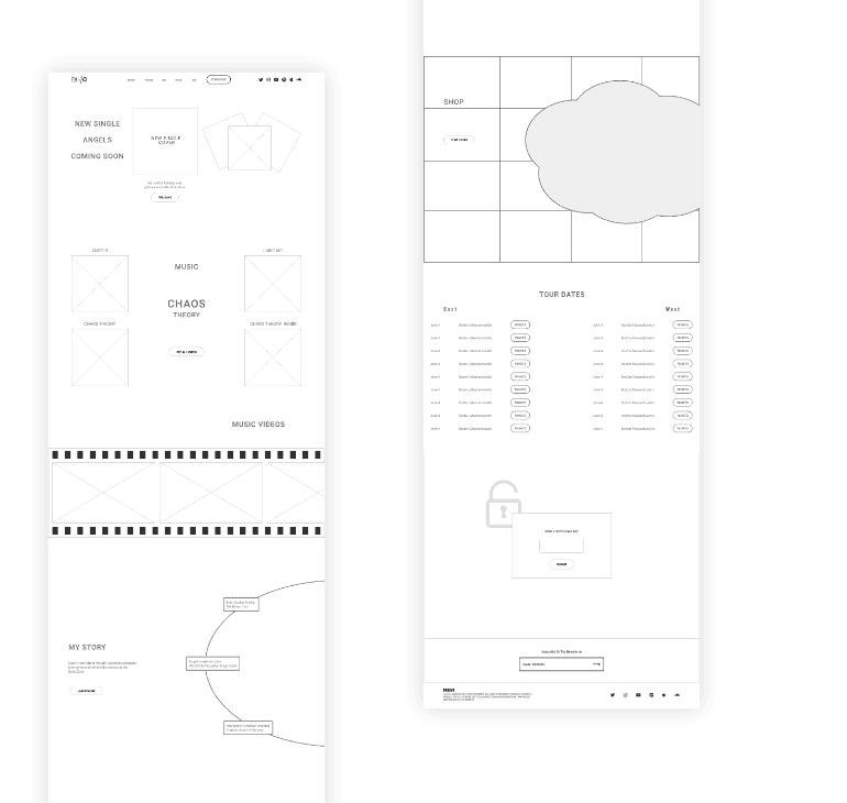
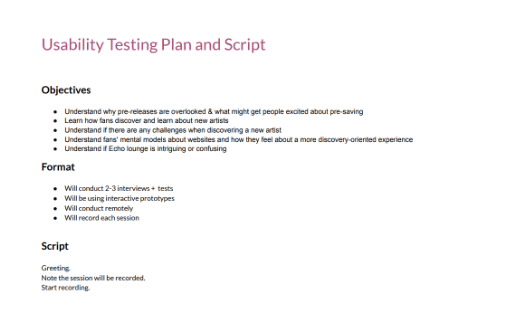
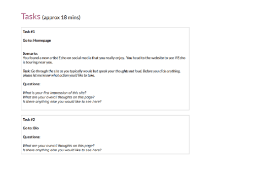
I needed to gauge user interest in joining a fan portal. I quickly turned my wire sketches into lo-fi wireframes and was ready to evaluate my design decisions. I prepared the usability script and started to recruit people. There were 3 participants in total. I sent them the prototype and they shared their screens as we conducted the testing.
What's working
Overall, users liked the layout of the page. They commented that it was easy navigating the typical sections they visit on artist websites.
The fan portal brought their attention to the pre-save feature. This was very important to note, as it was the top high level goal.
The interface felt interesting and not conventional for an artist website. One user commented that it felt "less transactional and more personal. The site felt more like an extension of the artist." As I was trying to incorporate the artist's brand identity into an e-commerce experience, this was extremely positive feedback.
What needs improvement
Majority of the users felt intrigued by the fan portal. They did express that depending on their interest for the artist, they may or may not pre-save to access more content through the fan portal. Next Step: Utilize appealing UI to invoke curiosity at the fan portal.
The biography section was intended to be a quick glimpse into who the artist is. This felt too short and users wanted to learn more about her background and her recent achievements, especially since Echo is a new underground artist. Next Step: Include a more in depth biography section in the fan portal.
There was confusion in the music section about which were albums or singles. The labels needed to be more clear, particularly for users unfamiliar with her work. Next Step: Rename labels for better clarity.

IDEATION
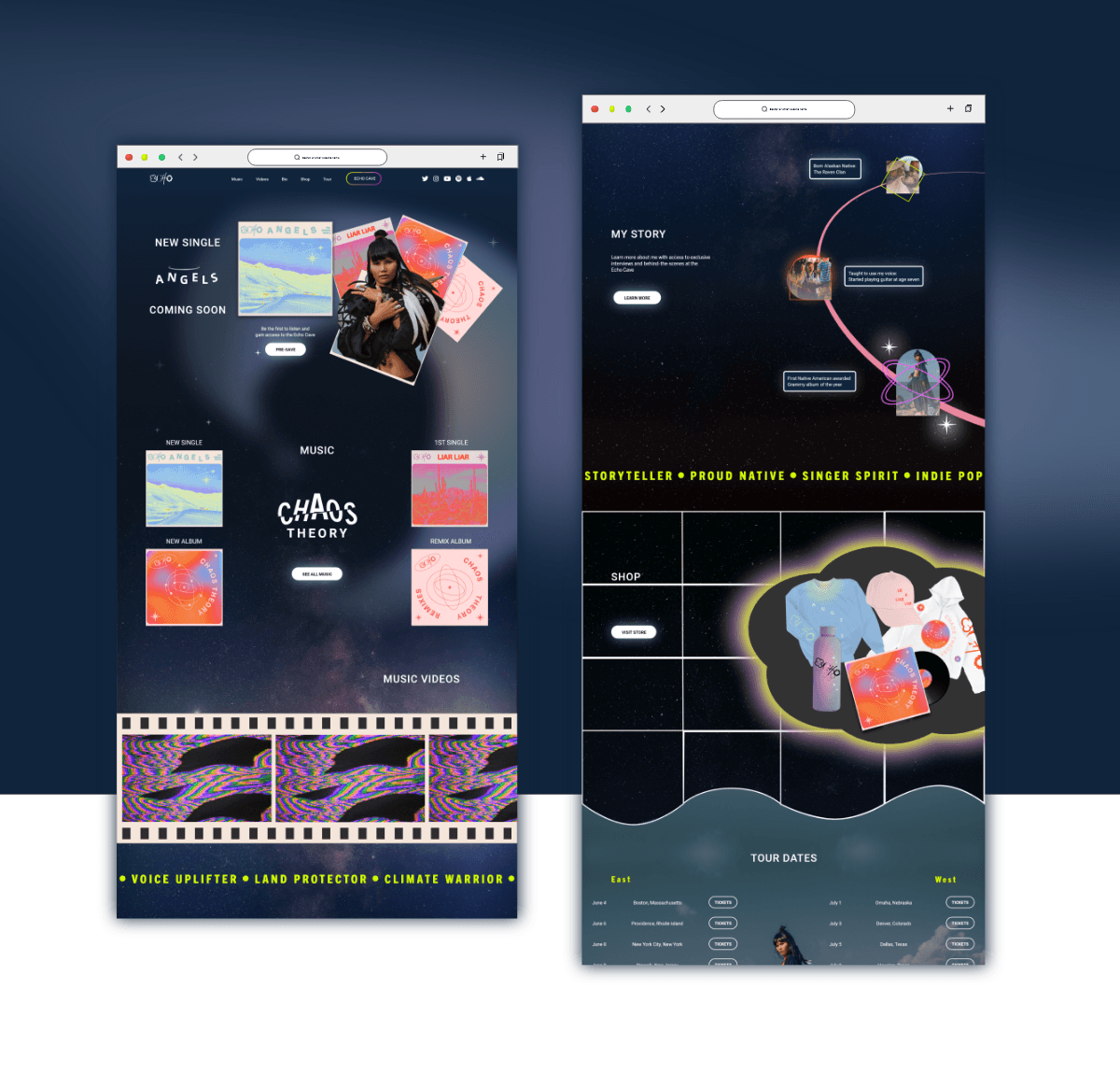
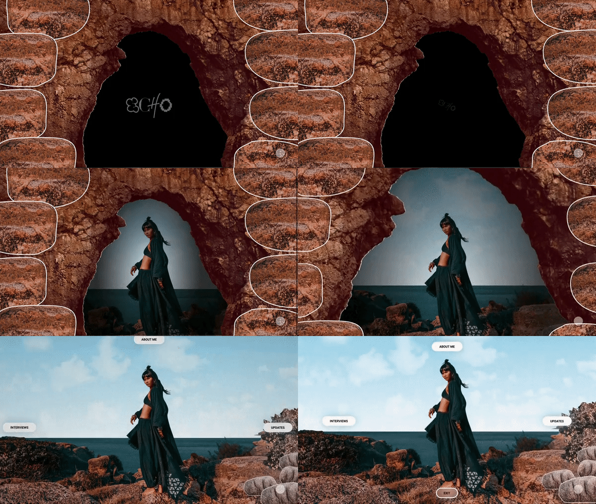
I loved the idea of creating a physical space that reflects her brand and makes her fans feel more connected to her story. I played around with the stock images provided by the stakeholder, and decided that I could stitch these images to create backgrounds of different places and use collage elements for animations and connectivity.
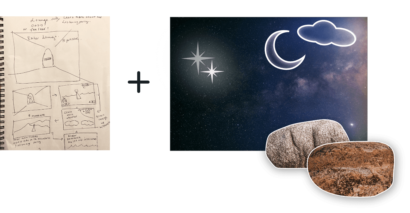
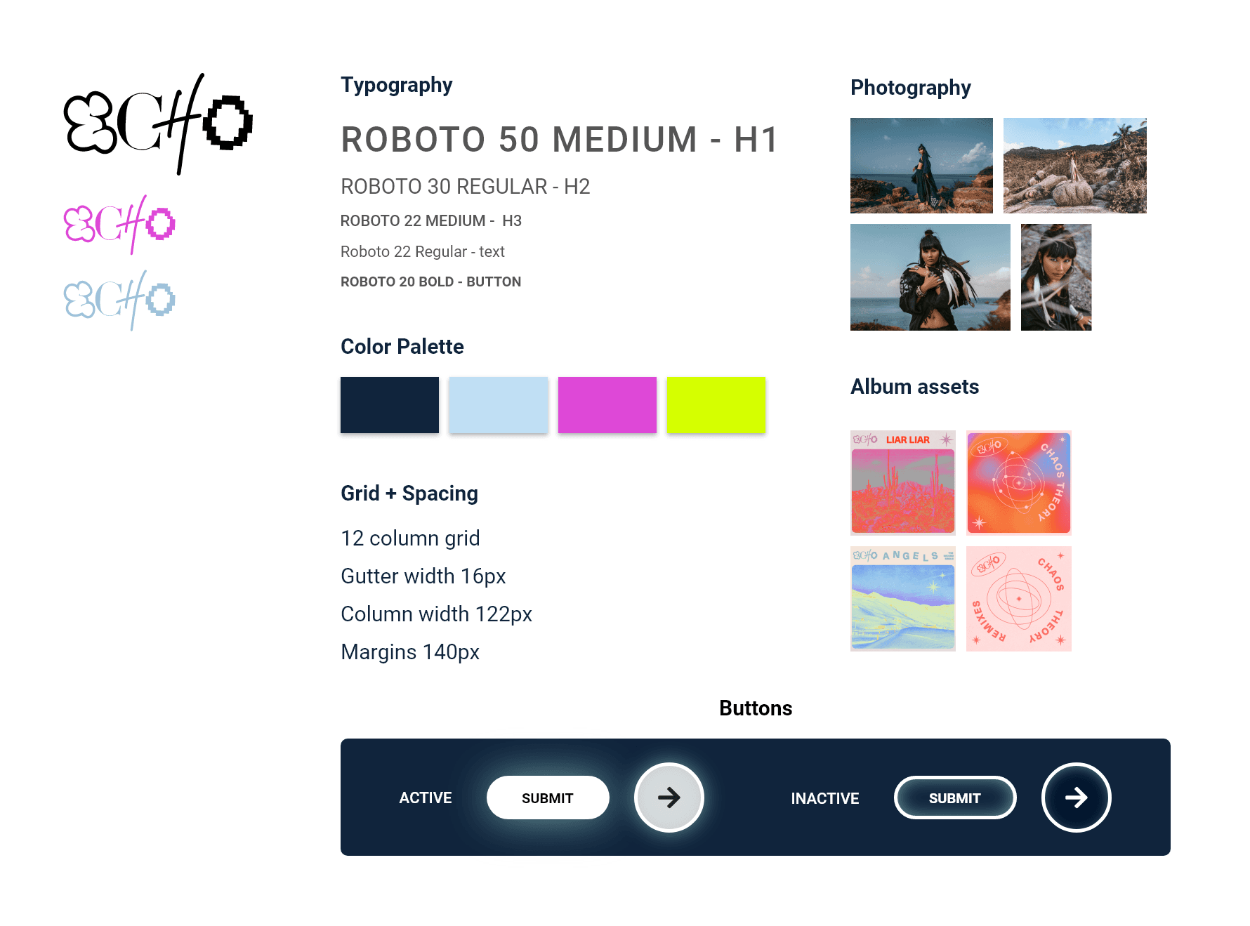
The stakeholder wanted a darker UI with colorful accents. Echo's personality was described as playful, dark, moody and artsy. Using her album covers as inspiration, I further developed her brand identity, showcasing her strong connections to her heritage as they reflect in her connection to nature.
VISUAL ELEMENTS

FINAL PRODUCT
OVERVIEW
As part of a collaboration between RCA Records, Adobe Experience Lab and Elizé Presents, I got to participate in the UX design process for a real life inspired project. The goal was to design a site for an artist to promote the release of her album and tour.
PROBLEM
Artists webpages weren't selling the Pre-Save
1) Majority of users weren't aware of the Pre-save feature or chose to ignore it.
2) Site served as a get-in-get-out experience. Users weren't revisiting the site.
Pre-saving an artists' single or album allows it, upon release, to be immediately available on your chosen streaming platform. During the stakeholder meeting with lead interactive designer at RCA Records, I learned that users were not compelled to pre-save artists’ new album/single. Pre-saving directly impacts the artists’ standing in the Billboard charts. The stakeholder wanted a website design that inspires fans to pre-save their songs, and drive connection by creating a fan portal.
SOLUTION
Entice users to pre-save by invoking their curiosity with a fan portal

Explain what pre-saving is
Provides clarity that pre-saving offers earliest access to latest music release
Eliminates user confusion
Gives fans a means to support their favorite artist

Incentivize the pre-save
Restrict access to exclusive content available through pre-saving
Utilize appealing UI to invoke curiosity
Encourages engagement with artist outside social media

Post announcements on Fan Portal
Fans can keep up to date with latest appearances, live sessions, etc.
Increase number of returning visitors
Invites user to discover more about the artist

COMPETITIVE ANALYSIS + THE GAP
It was NOT explained what pre-saving
is by the competition

When conducting my competitive analysis, I noticed that none of the artist pages were transparent on the function of pre-saving, an essential contributor to their success in the industry. This presented an opportunity for a solution.
USER RESEARCH
My interviewees felt that there was a lack of incentive to pre-save an album or single
To gain a deeper understanding of how music lovers interact with artist webpages I interviewed 4 candidates who were fans of music and have previously visited artist webpages and asked them the following questions:
1) When you discover a new artist you like, what are some typical next steps you take?
a) Are there any challenges you face when trying to learn about a new artist?
2) What is your process for learning about a new artist?
a) Can you walk me through a recent artist that you learned about?
3) Are there any memorable artist websites you’ve been on?
4) Walk me through the last time you were on an artist website.
5) Have you ever pre-saved or pre-ordered an album or song release? Why or why not?

MAIN INSIGHTS
Upvoting which user needs offer the highest impact
Data points organized via affinity mapping
Purple dots = Priority for user needs
Yellow dots = Priority for business needs

A biography section was a priority for the user to learn more about the artist, as well as for the business to drive SEO and build connection.
The user feedback was organized into corresponding sections of the website and then into common sentiment. The business needs were upvoted first. The most consistent user feedback was upvoted next. This feedback was used to iterate and decide on the final sitemap for the website.
DEFINE AND SYNTHESIZE
Visits to artist websites were not primarily motivated by engagement and connection
It is no surprise that users who want to connect and engage with artists will head to their social media first. Artists provide exclusive, insider content that build connection with their fanbase. It is noteworthy that searching for tour information was the primary reason users visit an artist's website. This may be because it is almost always exclusively located on their website and not on socials. Therefore, in order to encourage returning visitors I needed to establish exclusive content accessible only through their website.
How might we make the fan excited to engage with the pre-release?
How might we make the fan feel connected to the artist's story?
How might we build deeper connection with our fans through the new release?
PROTOTYPE TESTING
I needed to gauge user interest in joining a fan portal. I quickly turned my wire sketches into lo-fi wireframes and was ready to evaluate my design decisions. I prepared the usability script and started to recruit people. There were 3 participants in total. I sent them the prototype and they shared their screens as we conducted the testing.

What's working
Overall, users liked the layout of the page. They commented that it was easy navigating the typical sections they visit on artist websites.
The fan portal brought their attention to the pre-save feature. This was very important to note, as it was the top high level goal.
The interface felt interesting and not conventional for an artist website. One user commented that it felt "less transactional and more personal. The site felt more like an extension of the artist." As I was trying to incorporate the artist's brand identity into an e-commerce experience, this was extremely positive feedback.
What needs improvement
Majority of the users felt intrigued by the fan portal. They did express that depending on their interest for the artist, they may or may not pre-save to access more content through the fan portal. Next Step: Utilize appealing UI to invoke curiosity at the fan portal.
The biography section was intended to be a quick glimpse into who the artist is. This felt too short and users wanted to learn more about her background and her recent achievements, especially since Echo is a new underground artist. Next Step: Include a more in depth biography section in the fan portal.
There was confusion in the music section about which were albums or singles. The labels needed to be more clear, particularly for users unfamiliar with her work. Next Step: Rename labels for better clarity.


IDEATION
I loved the idea of creating a physical space that reflects her brand and makes her fans feel more connected to her story. I played around with the stock images provided by the stakeholder, and decided that I could stitch these images to create backgrounds of different places and use collage elements for animations and connectivity.

The stakeholder wanted a darker UI with colorful accents. Echo's personality was described as playful, dark, moody and artsy. Using her album covers as inspiration, I further developed her brand identity, showcasing her strong connections to her heritage as they reflect in her connection to nature.
VISUAL ELEMENTS

FINAL PRODUCT
OVERVIEW
As part of a collaboration between RCA Records, Adobe Experience Lab and Elizé Presents, I got to participate in the UX design process for a real life inspired project. The goal was to design a site for an artist to promote the release of her album and tour.
PROBLEM
Artists webpages weren't selling the Pre-Save
1) Majority of users weren't aware of the Pre-save feature or chose to ignore it.
2) Site served as a get-in-get-out experience. Users weren't revisiting the site.
Pre-saving an artists' single or album allows it, upon release, to be immediately available on your chosen streaming platform. During the stakeholder meeting with lead interactive designer at RCA Records, I learned that users were not compelled to pre-save artists’ new album/single. Pre-saving directly impacts the artists’ standing in the Billboard charts. The stakeholder wanted a website design that inspires fans to pre-save their songs, and drive connection by creating a fan portal.
SOLUTION
Entice users to pre-save by invoking their curiosity with a fan portal

Explain what pre-saving is
Provides clarity that pre-saving offers earliest access to latest music release
Eliminates user confusion
Gives fans a means to support their favorite artist

Incentivize the pre-save
Restrict access to exclusive content available through pre-saving
Utilize appealing UI to invoke curiosity
Encourages engagement with artist outside social media

Post announcements on Fan Portal
Fans can keep up to date with latest appearances, live sessions, etc.
Increase number of returning visitors
Invites user to discover more about the artist

COMPETITIVE ANALYSIS + THE GAP
It was NOT explained what pre-saving
is by the competition

When conducting my competitive analysis, I noticed that none of the artist pages were transparent on the function of pre-saving, an essential contributor to their success in the industry. This presented an opportunity for a solution.
USER RESEARCH
My interviewees felt that there was a lack of incentive to pre-save an album or single
To gain a deeper understanding of how music lovers interact with artist webpages I interviewed 4 candidates who were fans of music and have previously visited artist webpages and asked them the following questions:
1) When you discover a new artist you like, what are some typical next steps you take?
a) Are there any challenges you face when trying to learn about a new artist?
2) What is your process for learning about a new artist?
a) Can you walk me through a recent artist that you learned about?
3) Are there any memorable artist websites you’ve been on?
4) Walk me through the last time you were on an artist website.
5) Have you ever pre-saved or pre-ordered an album or song release? Why or why not?

MAIN INSIGHTS
Upvoting which user needs offer the highest impact
Data points organized via affinity mapping
Purple dots = Priority for user needs
Yellow dots = Priority for business needs

A biography section was a priority for the user to learn more about the artist, as well as for the business to drive SEO and build connection.
The user feedback was organized into corresponding sections of the website and then into common sentiment. The business needs were upvoted first. The most consistent user feedback was upvoted next. This feedback was used to iterate and decide on the final sitemap for the website.
DEFINE AND SYNTHESIZE
Visits to artist websites were not primarily motivated by engagement and connection
It is no surprise that users who want to connect and engage with artists will head to their social media first. Artists provide exclusive, insider content that build connection with their fanbase. It is noteworthy that searching for tour information was the primary reason users visit an artist's website. This may be because it is almost always exclusively located on their website and not on socials. Therefore, in order to encourage returning visitors I needed to establish exclusive content accessible only through their website.
How might we make the fan excited to engage with the pre-release?
How might we make the fan feel connected to the artist's story?
How might we build deeper connection with our fans through the new release?
PROTOTYPE TESTING
I needed to gauge user interest in joining a fan portal. I quickly turned my wire sketches into lo-fi wireframes and was ready to evaluate my design decisions. I prepared the usability script and started to recruit people. There were 3 participants in total. I sent them the prototype and they shared their screens as we conducted the testing.

What's working
Overall, users liked the layout of the page. They commented that it was easy navigating the typical sections they visit on artist websites.
The fan portal brought their attention to the pre-save feature. This was very important to note, as it was the top high level goal.
The interface felt interesting and not conventional for an artist website. One user commented that it felt "less transactional and more personal. The site felt more like an extension of the artist." As I was trying to incorporate the artist's brand identity into an e-commerce experience, this was extremely positive feedback.
What needs improvement
Majority of the users felt intrigued by the fan portal. They did express that depending on their interest for the artist, they may or may not pre-save to access more content through the fan portal. Next Step: Utilize appealing UI to invoke curiosity at the fan portal.
The biography section was intended to be a quick glimpse into who the artist is. This felt too short and users wanted to learn more about her background and her recent achievements, especially since Echo is a new underground artist. Next Step: Include a more in depth biography section in the fan portal.
There was confusion in the music section about which were albums or singles. The labels needed to be more clear, particularly for users unfamiliar with her work. Next Step: Rename labels for better clarity.


IDEATION
I loved the idea of creating a physical space that reflects her brand and makes her fans feel more connected to her story. I played around with the stock images provided by the stakeholder, and decided that I could stitch these images to create backgrounds of different places and use collage elements for animations and connectivity.

The stakeholder wanted a darker UI with colorful accents. Echo's personality was described as playful, dark, moody and artsy. Using her album covers as inspiration, I further developed her brand identity, showcasing her strong connections to her heritage as they reflect in her connection to nature.
VISUAL ELEMENTS
